![marq.svg]](https://help.marq.com/hubfs/Brand%20Logos/marq.svg)
Step 1: Create a desktop and mobile project
You will want to create a design the fits your intended screen size for both desktop and mobile. Typically, you should design the desktop version of the project, duplicate it, and then create a mobile version with the same content. The desktop version will typically be wider while the mobile version will be slim and the text large and easy to read.
Follow the below steps to create a mobile version of your project:
- Duplicate your file
- Name the duplicate "mobile"
- Change the size of the mobile version (Typically anywhere between 400-600px is suitable for mobile)
- Adjust your content to fit the mobile screen-size
While designing, you can add links to shapes and images so that the areas will be clickable in your email.
Here are some same sample templates to get you started:
Desktop template
Mobile template
Step 2: Create the embed code
In both mobile and desktop versions, click the share dropdown > embed in email > select “multiple-links” > export code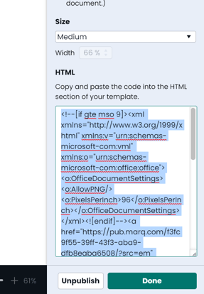
Step 3: Combine the code in a text-edit file
Open a text-edit file and add the following:
<body></body>
Paste both codes that you exported from your projects within the body code. (view example)
Step 4: Create your style code
Above the body code, create a style snippet.
Paste the following:
<style>
@media only screen and (min-width: 640px) {

.desktopview {
display:block!important;
}

.mobileview {
display:none!important;
}
}

@media only screen and (max-width: 640px) {

.desktopview {
display:none!important;
}

.mobileview {
display:block!important;
}
}

</style>
Step 5: Add the classes to your HTML elements for both desktop and mobile versions of the project
Once you have done this, add the classes to your tables in each version of your project as shown: (Add the mobile class to the mobile code and the desktop class to the desktop code)
Here is an example snippet of all the code put together.
Step 6: Paste the code into your HTML platform
As you test, you will notice depending on your screen-size with viewing on mobile or desktop, the content will automatically adjust to the different versions.